Reimagining Second-Hand Shopping
UX/UI Design for an Engaging App Experience
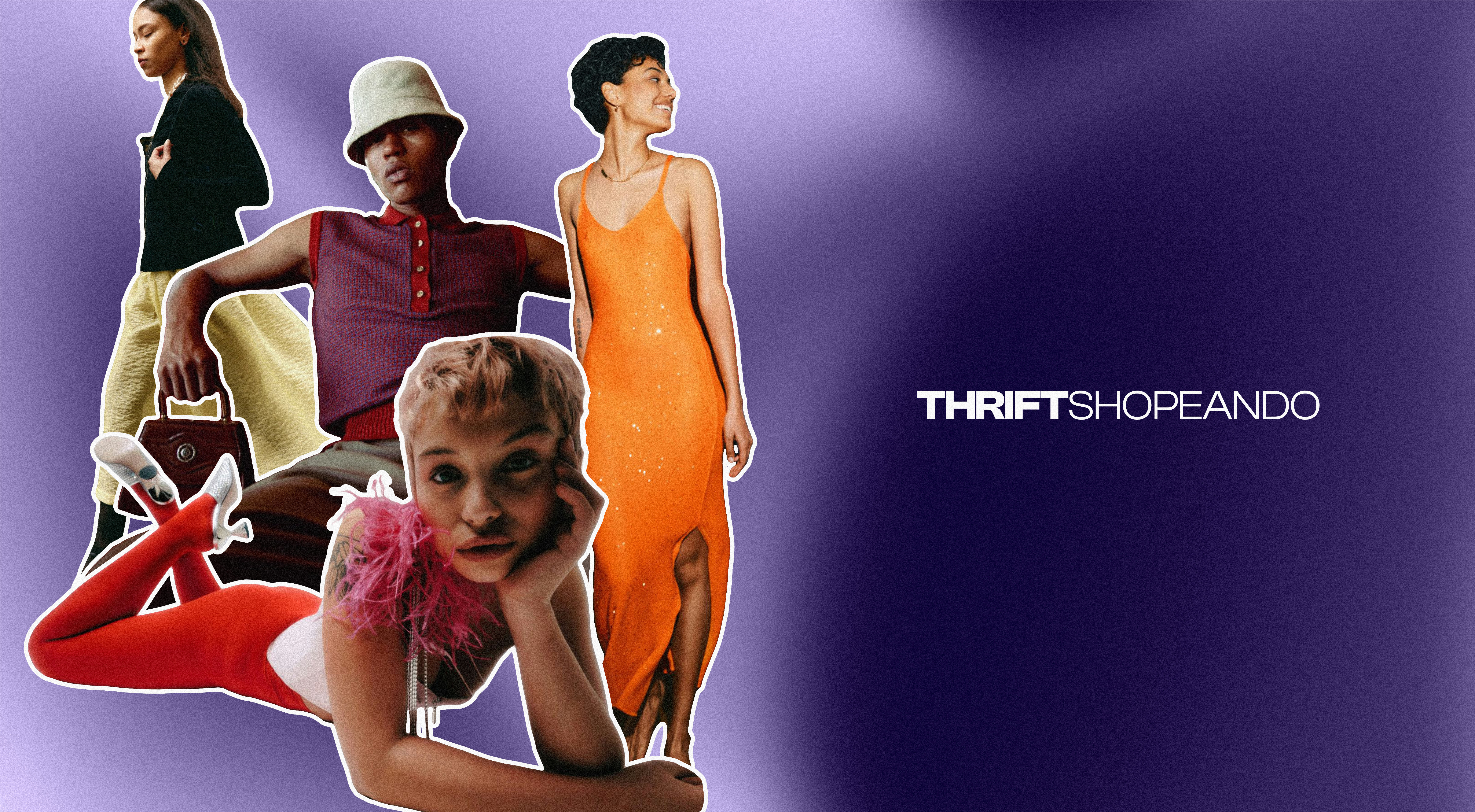
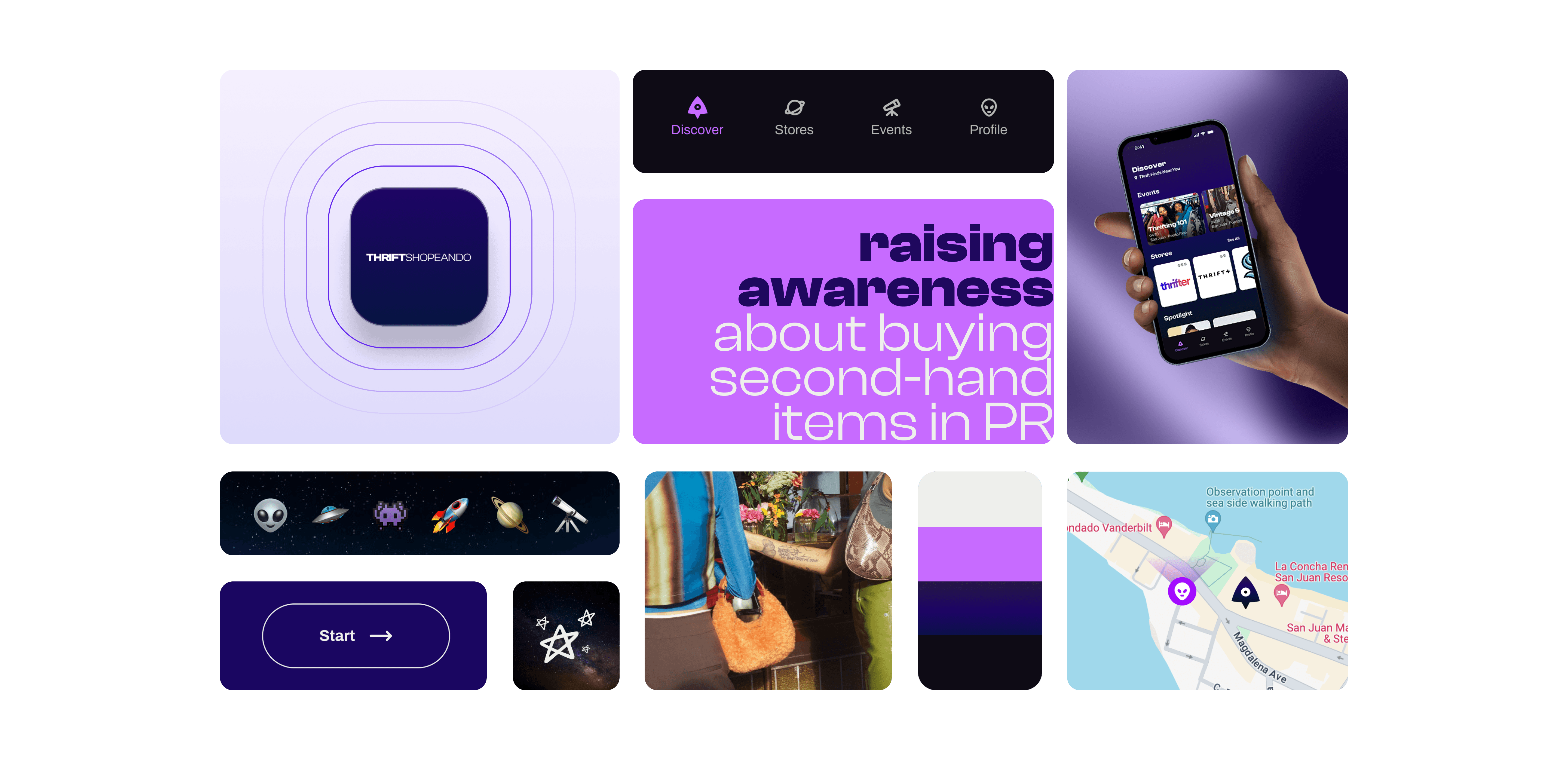
Thrift Shoppeando is a prototype app designed to educate and raise awareness about purchasing second-hand items in Puerto Rico. The app aims to provide a seamless and engaging user experience, making thrift shopping more accessible and fostering a strong community among thrift enthusiasts.
Client
Thrift Shoppeando
Project Date
April 2024, 2 weeks
Role/Execution
Creative Direction, Visual Design, Design System, User Research, and Prototypes
Team Members
Carlos Gómez, Martha Perez, and Nanushka Santiago
Reimagining Second-Hand Shopping
UX/UI Design for an Engaging App Experience

Thrift Shoppeando is a prototype app designed to educate and raise awareness about purchasing second-hand items in Puerto Rico. The app aims to provide a seamless and engaging user experience, making thrift shopping more accessible and fostering a strong community among thrift enthusiasts.
Client
Thrift Shoppeando
Project Date
April 2024, 2 weeks
Role/Execution
Creative Direction, Visual Design, Design System, User Research, and Prototypes
Team Members
Carlos Gómez, Martha Perez, and Nanushka Santiago

Design Challenge
Thrift enthusiasts in Puerto Rico faced challenges such as limited size availability, low awareness of thrift stores and events, and difficulty accessing information about local thrift shops. They needed a centralized platform with comprehensive details about thrift stores, events, and upcycling designers.
Discovering the Problem
The most frequent inquiries from research, surveys, and interviews were selected, initiating a journey based on them. Multiple screens and design sprints were developed to create design principles that make this experience unique and address the needs of the platform's users.
Simplifying the User Experience
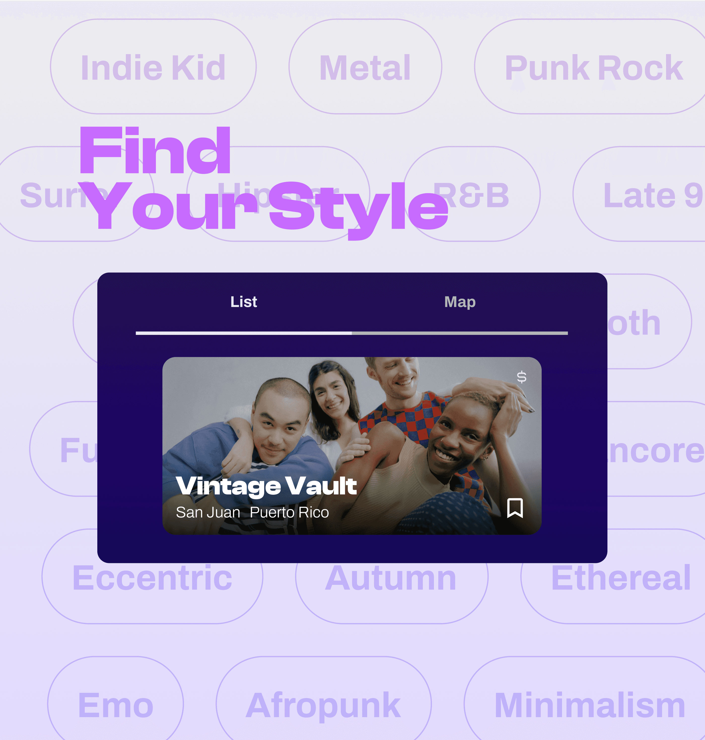
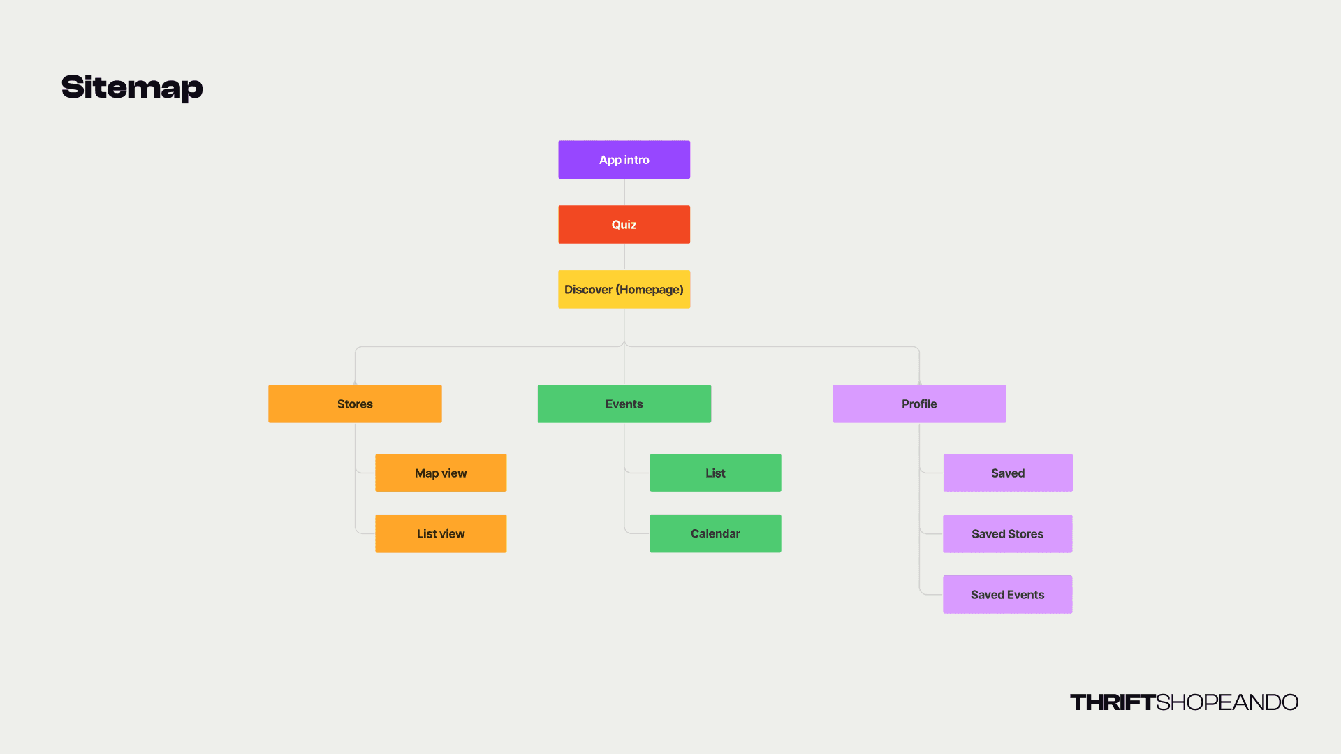
Essential features were prioritized, focusing on a detailed store directory, event listings, and search/filter options. Additional features include highlights for popular stores, user profiles, reviews, interactive maps, and community sharing options. Users can explore local stores within the app, customize their browsing experience through a quiz, discover local stores, and save favorite spots to their profile. The design uses gradients, sans-serif fonts, and simple UI elements to ensure clarity and visual appeal.
Design Journey
01
Research & Analysis
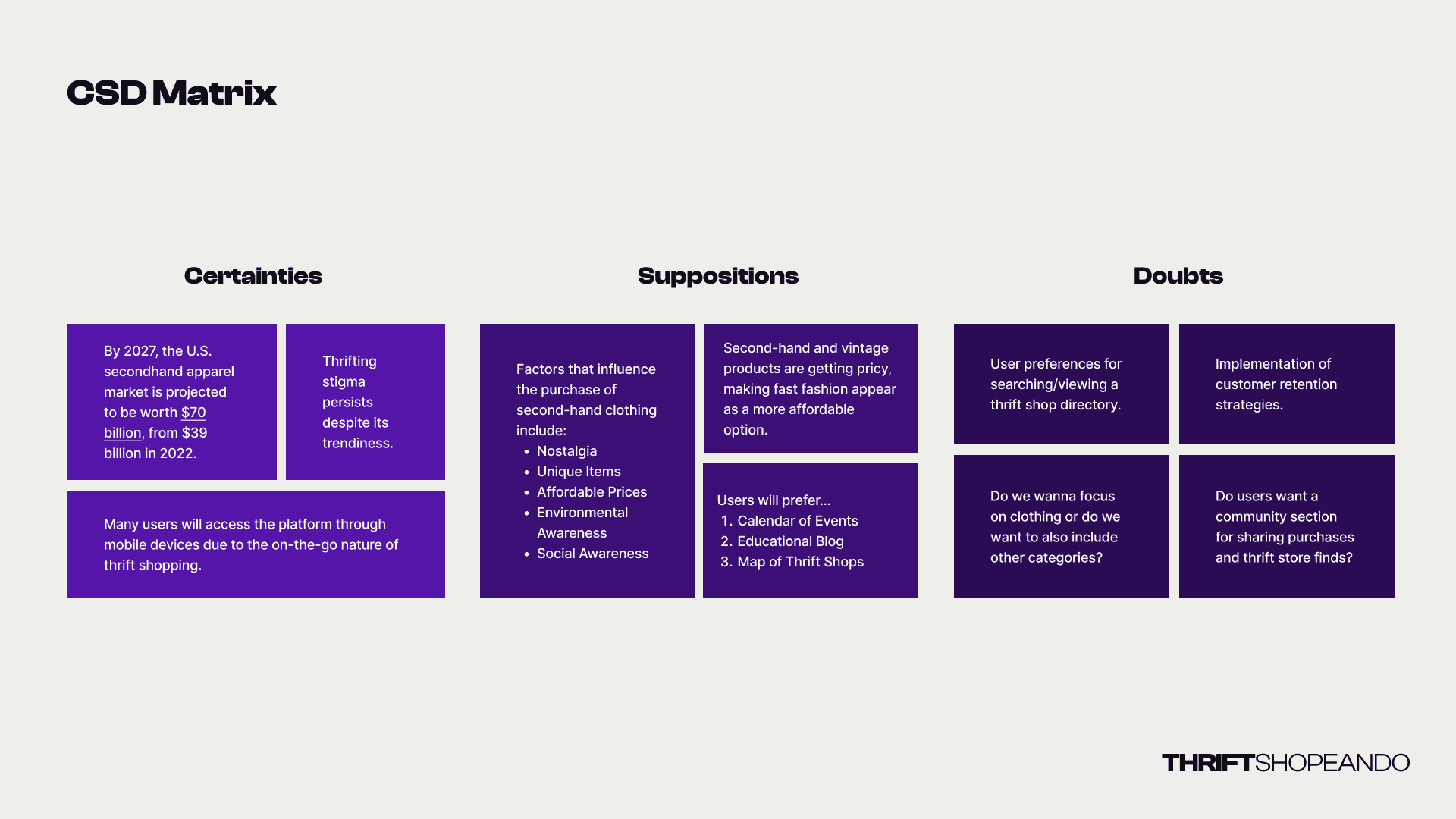
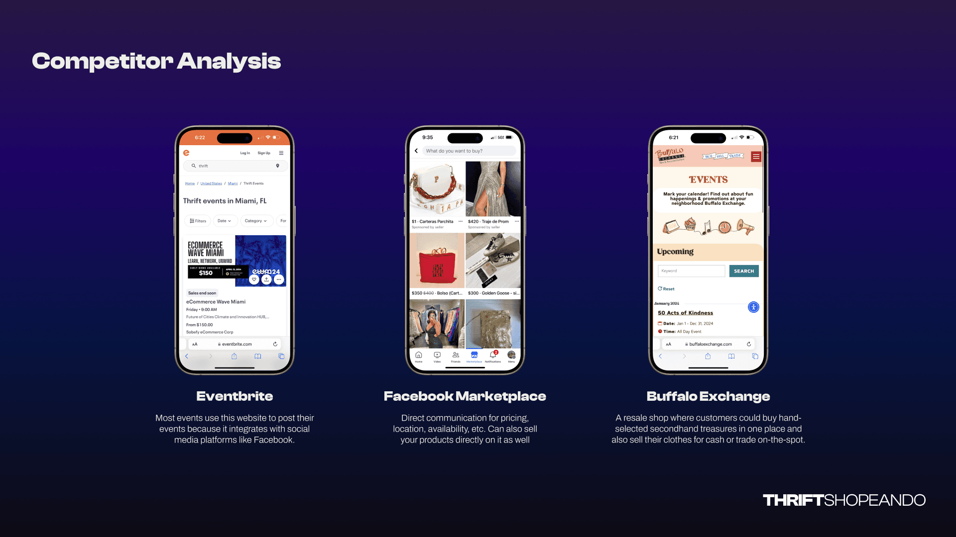
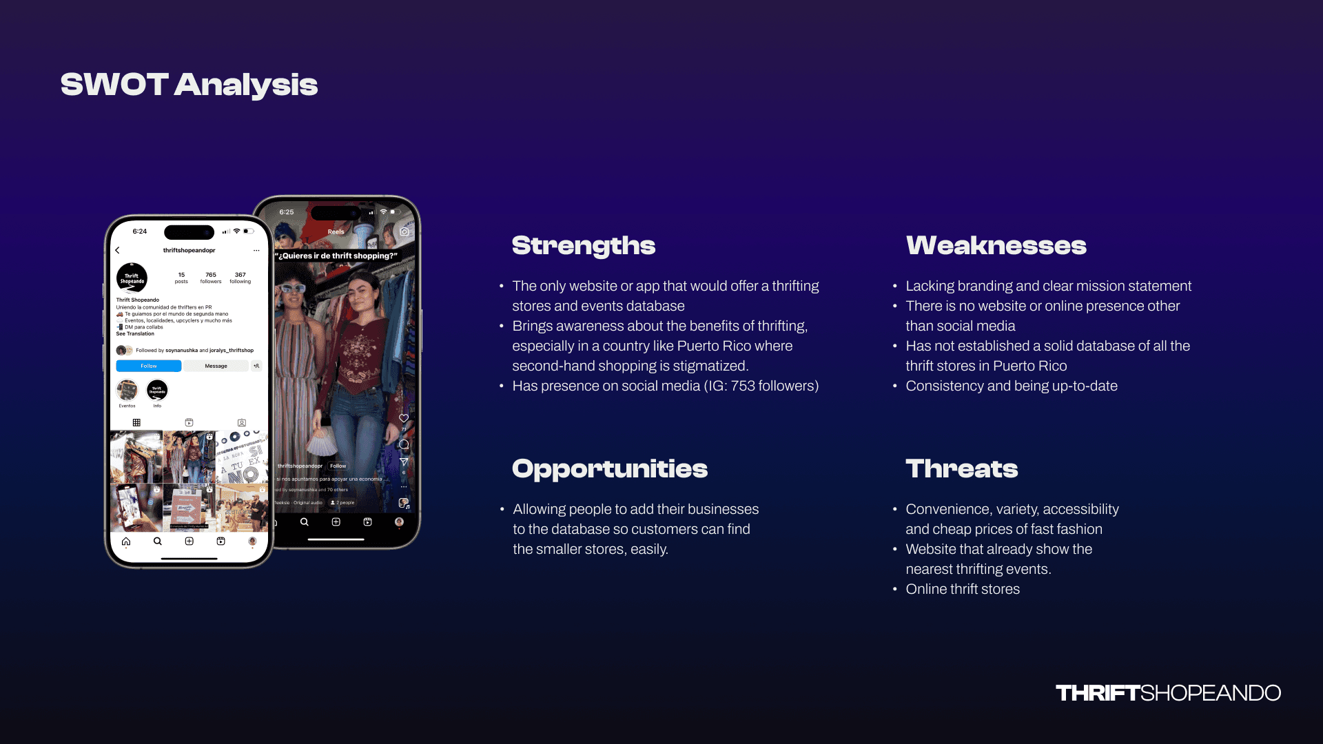
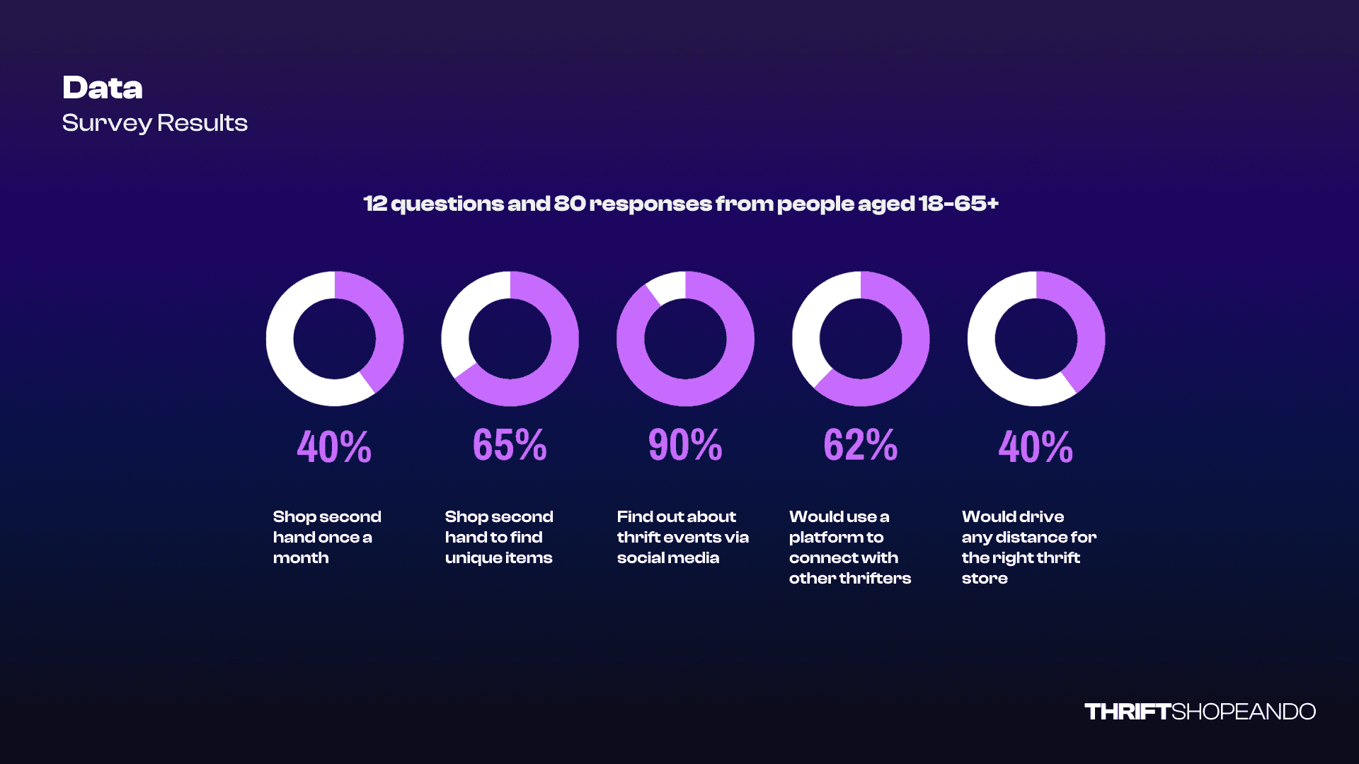
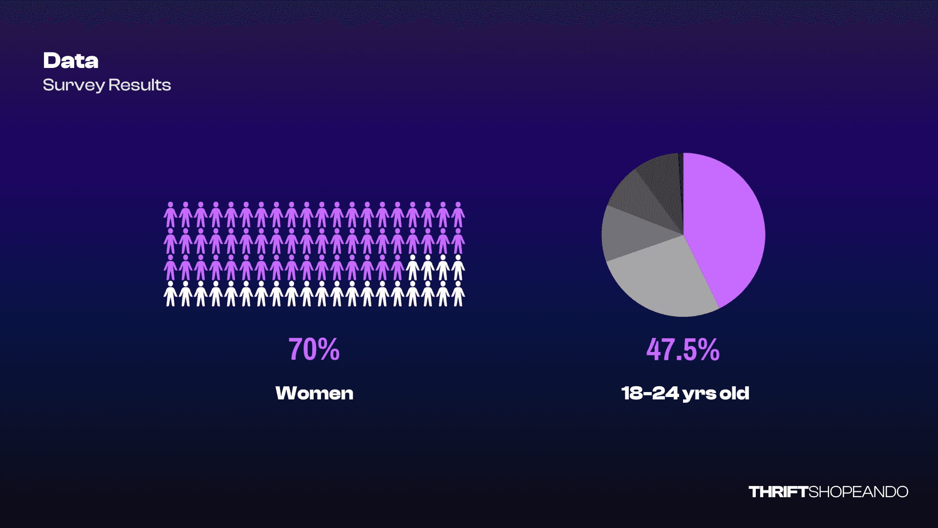
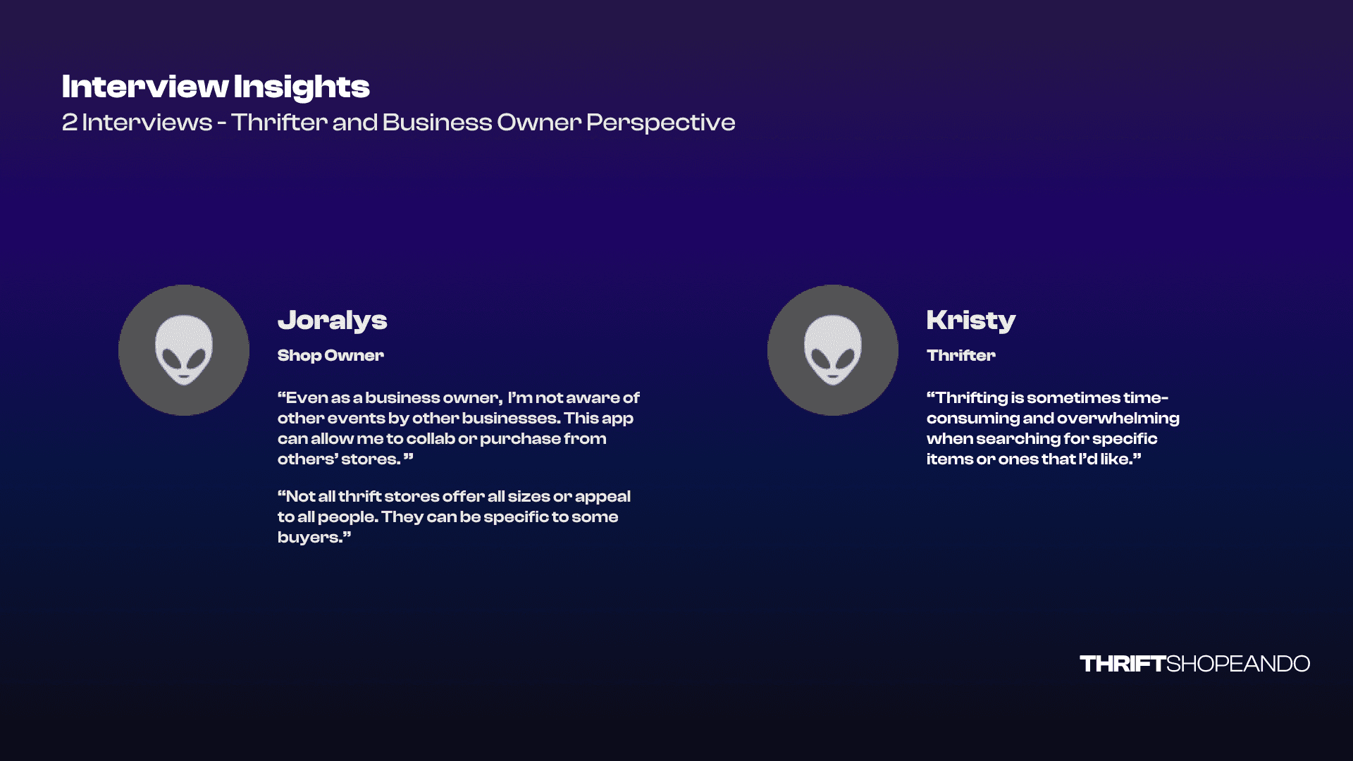
We explored key market insights and user behaviors to shape our design. Using the CSD Matrix, we identified critical trends like the projected $70 billion growth of the U.S. secondhand apparel market and the continued stigma surrounding thrifting. We also focused on mobile accessibility and considered features such as event calendars and thrift shop maps, while remaining uncertain about preferences for community features or a thrift directory. Insights from competitor analysis and SWOT analysis highlighted opportunities for Thrift Shoppeando to centralize listings and events in Puerto Rico, while user research revealed that 65% shop for unique items and 90% find thrift events via social media. Interviews with a shop owner and a thrifter emphasized the need for easier event discovery and a more efficient shopping experience, guiding our design decisions moving forward.
02
Understanding Our User
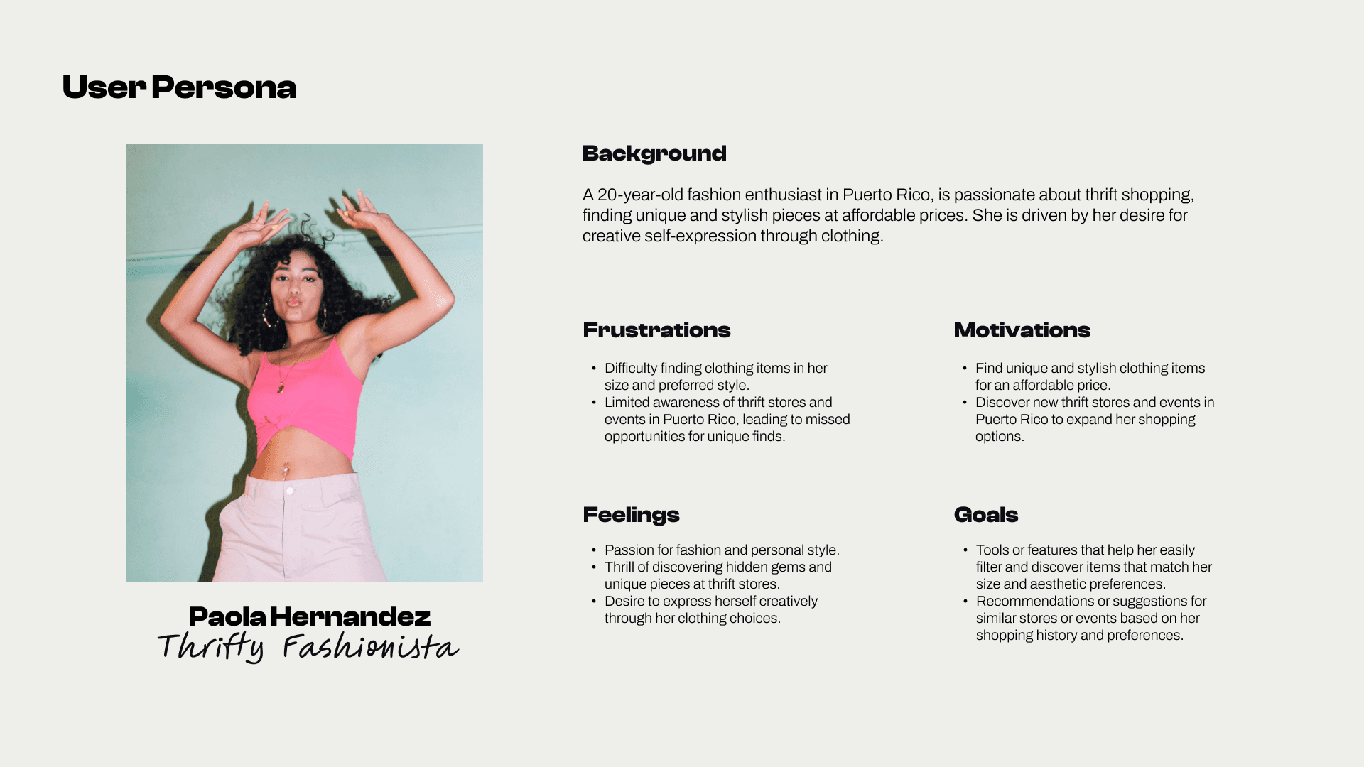
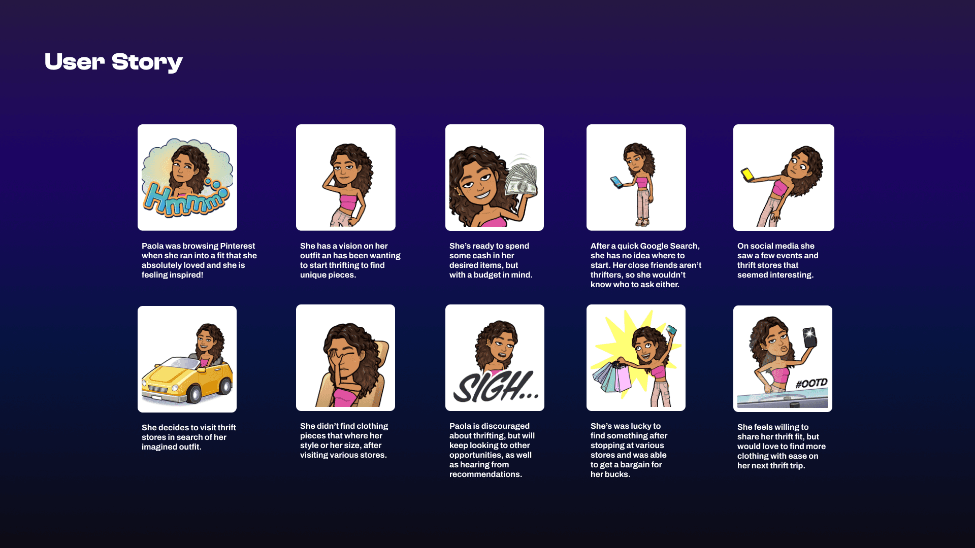
To truly understand Paola, our main user, we started by building a solid User Persona—a 20-year-old thrifting enthusiast who’s all about finding unique, affordable fashion in Puerto Rico. But like many, she struggles with discovering local thrift spots and finding clothes that fit her style and size. That’s where the User Story kicks in, following Paola as she browses Pinterest for outfit inspiration, gets frustrated by the lack of results, but ultimately finds her dream thrifted look and proudly shares it online. We then mapped out her emotional highs and lows in a detailed User Journey Map, where key opportunities stood out. Features like a thrift store directory, personalized clothing recommendations, and a community hub for sharing finds could transform her journey from a frustrating search to a streamlined, enjoyable experience. The map clearly highlighted that Paola, and users like her, need more than just a list of stores—they need inspiration and easy navigation tools to make the thrifting adventure more satisfying.
03
Ideation
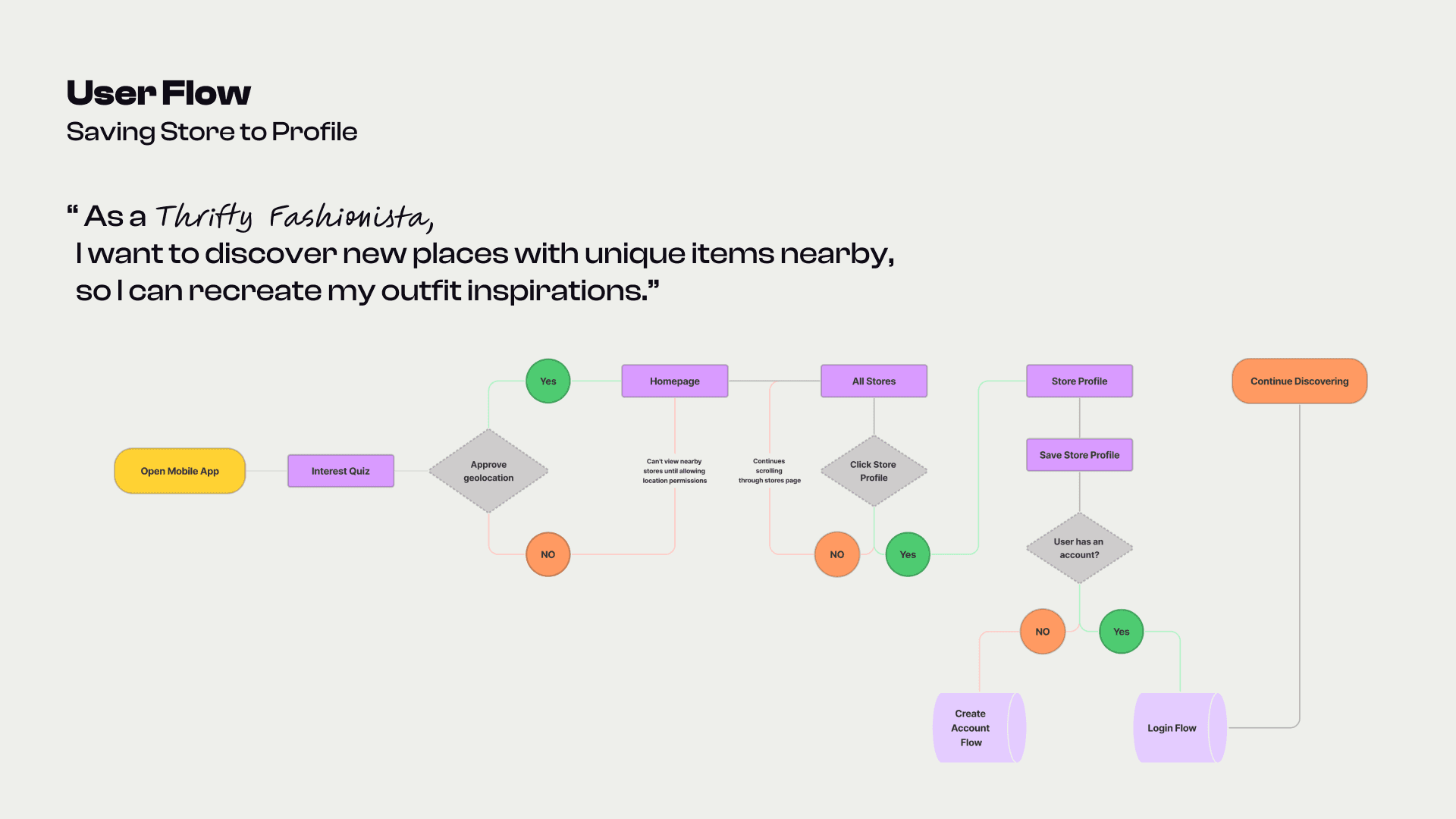
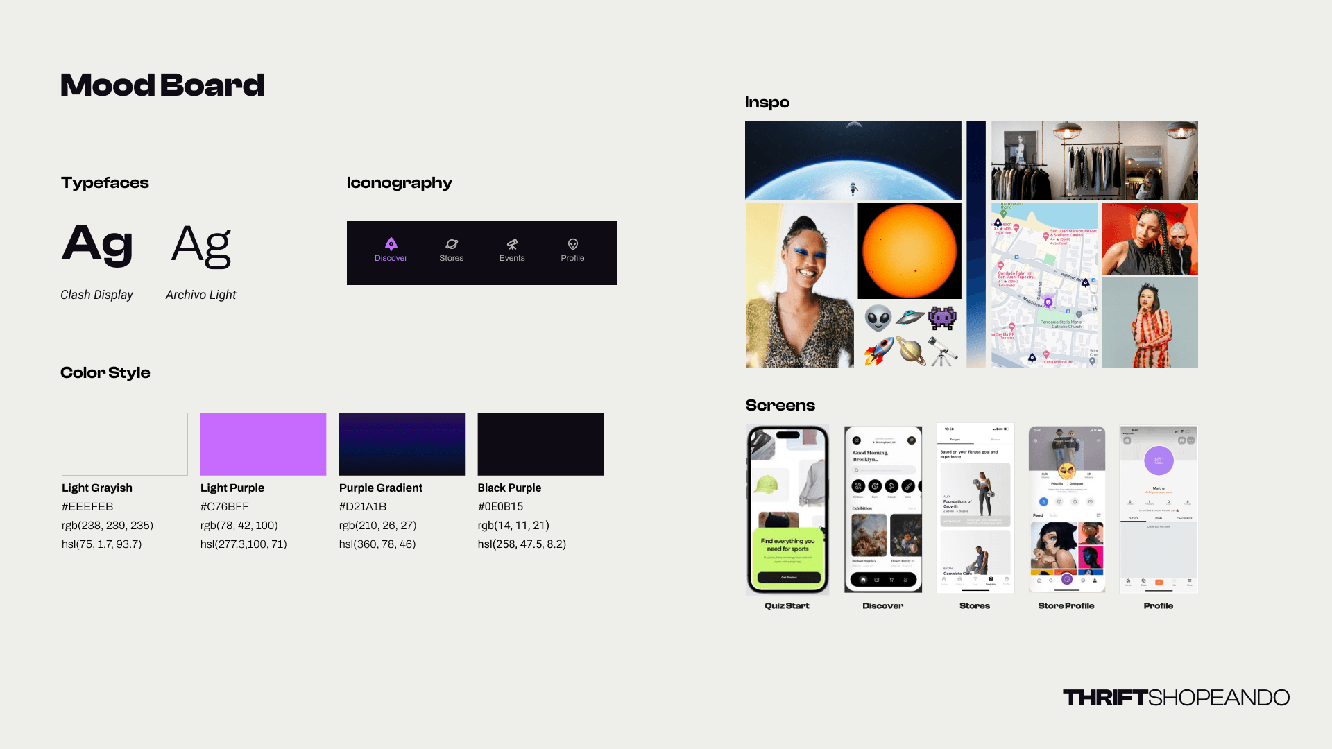
We mapped out the experience for Paola, our Thrifty Fashionista, through a tailored User Flow. We focused on the feature ‘Save Store to Profile’ to streamline her journey from discovery to action. After launching the app and completing an initial quiz for a personalized experience, Paola can explore nearby stores or manually search for her next treasure. If a store catches her eye, she views its profile and, with a quick sign-in or account creation, saves it for later. This flow makes it easy for users like Paola to curate their favorite stores and return whenever they need fresh inspiration. For the design, the Moodboard took inspiration from a cosmic theme, where each thrift store represents a unique planet waiting to be explored by our alien-like users. The visual identity plays with bold color gradients and clean sans-serif typography to balance creativity with simplicity. This ensures that while Paola navigates through stores and events, the interface remains intuitive and free from distractions, enhancing her overall discovery experience.
04
Wireframes to Testing
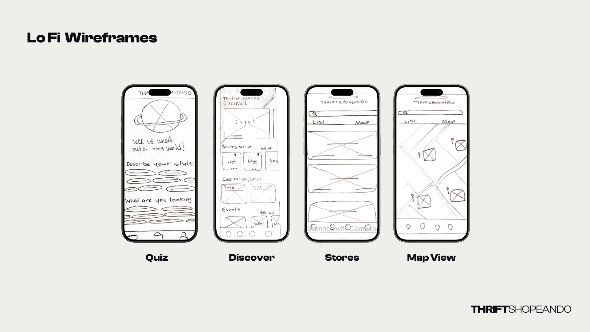
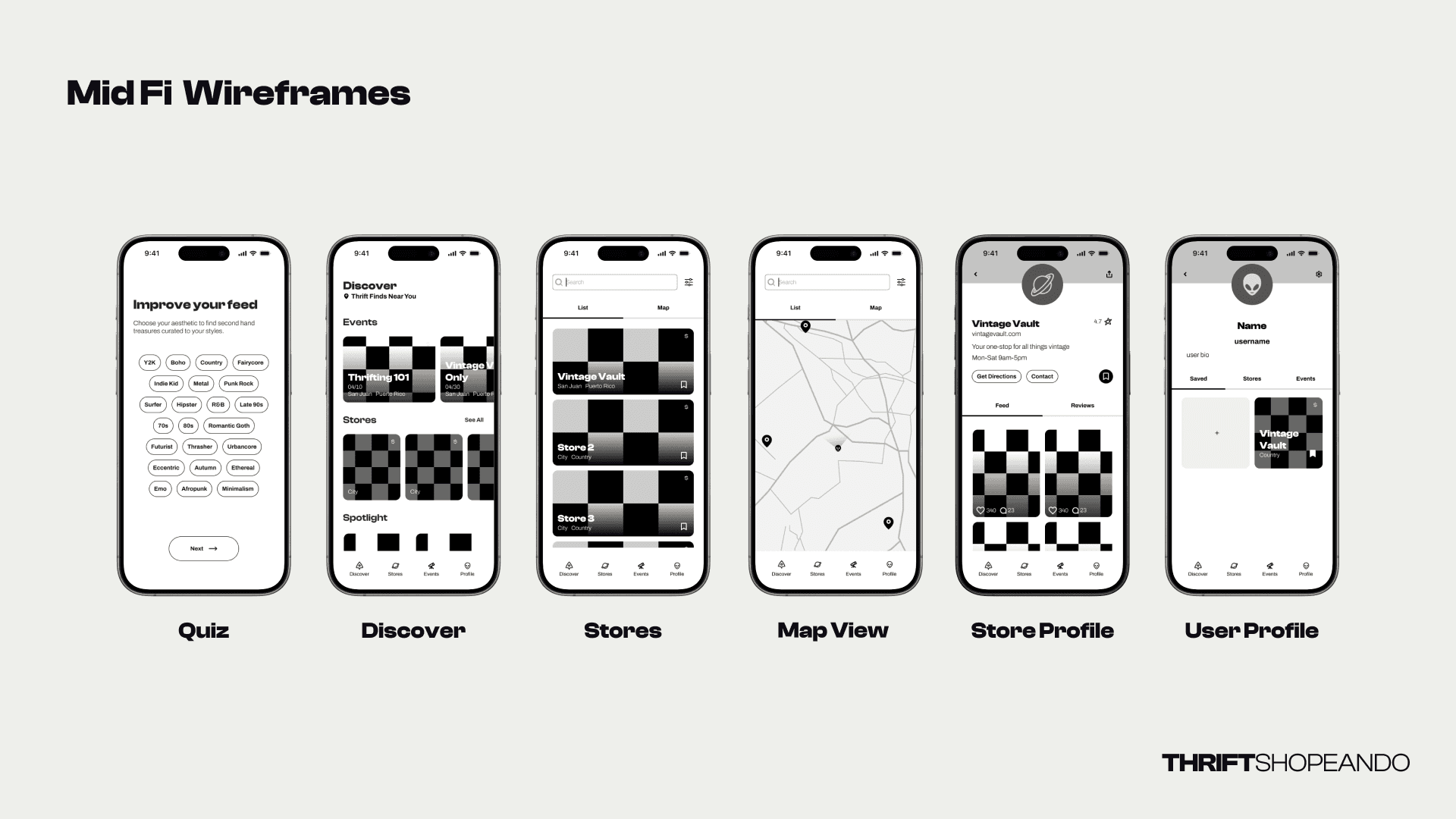
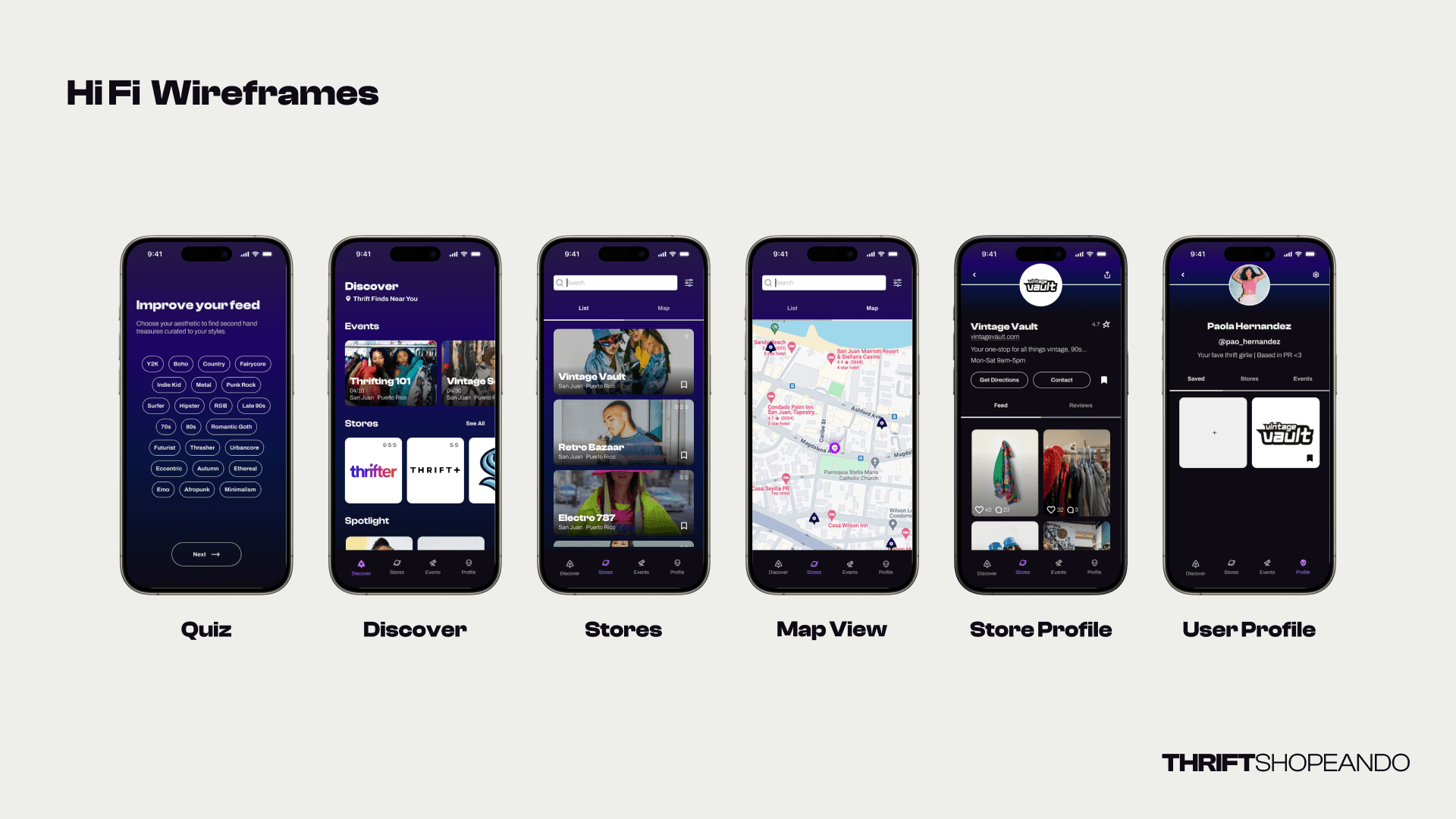
We kicked off with Lo-Fi Wireframes, sketching the core screens—quiz, discover, stores, and map view—to quickly map out the user flow without overcomplicating the design. This allowed us to focus on functionality first. Moving into Mid-Fi Wireframes, we refined the structure by adding UI components like buttons and labels, giving us a clearer idea of the app’s usability. This phase helped test navigation and flow before finalizing the design. In the Hi-Fi Wireframes, we added visual polish, bringing in the brand colors and imagery to reflect the app’s full experience. Usability testing through Useberry showed that 88% of users quickly understood how to save a store to their profile, with most completing the task in under 97 seconds. Based on this feedback, we made tweaks like adding more spacing between elements to improve clarity and navigation, ensuring a smooth user experience.
