Redefining Luxury Experiences
User Experience and Visual Strategy for a High-End Membership
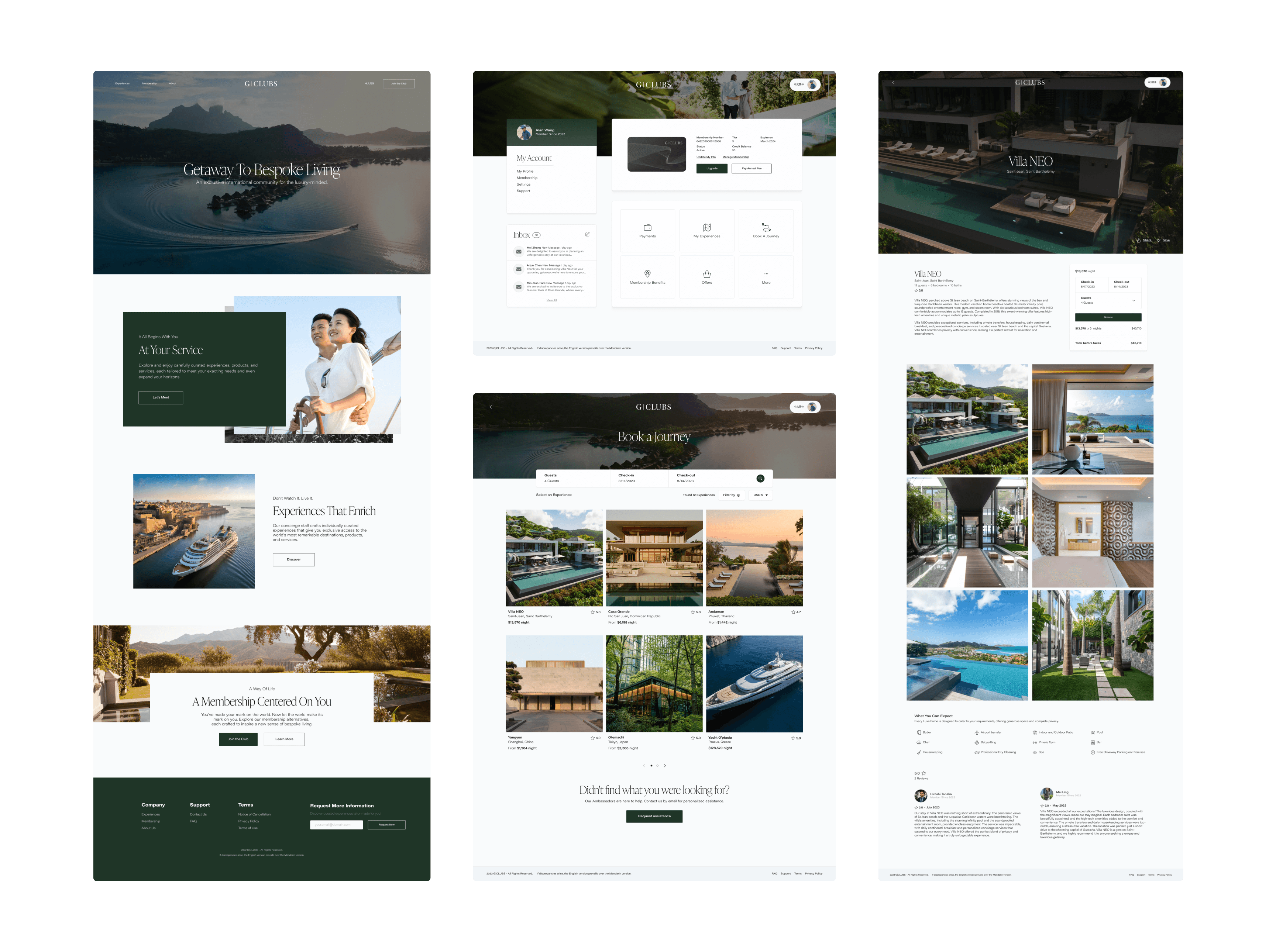
G|CLUBS sought to position itself as a platform for luxury memberships, offering exclusive services such as real-time bookings, personalized experiences, and access to premium content. My goal was to elevate the user experience by optimizing their membership portal and key tools such as the booking system and e-commerce features.
Client
G|CLUBS
Project Date
2022 - 2023
Role/Execution
Visual Design, Design System, User Experience, and Prototypes
Team Members
Carlos Gómez Cartagena, Dominique Myatt, Limarie Reyes, Jhonny Chamoun, Razu Ahmed, Adam, Gabriel Carrero, and Finnes Almenas
Results
50
%
reduction in time and clicks
to complete a booking through improved workflows.
40
+
reusable components
implemented in a design system with detailed documentation.
Improved
consistency across products
by aligning design standards for a cohesive user experience.
Results
50
%
reduction in time and clicks
to complete a booking through improved workflows.
40
+
reusable components
implemented in a design system with detailed documentation.
Improved
consistency across products
by aligning design standards for a cohesive user experience.
Design Challenge
The redesign of G|CLUBS’ digital experience was driven by the need to align its functionality with the brand’s exclusive image. The challenge was to develop a cohesive visual design that conveyed both simplicity and luxury while resolving usability issues that were impacting user satisfaction. The membership portal, booking system, and e-commerce functionalities required significant improvements, along with the implementation of a reusable design system that could adapt to future developments.
Exploring the Issues
The existing platform presented three primary challenges. Users faced frustration with lengthy and unintuitive processes that made navigation cumbersome. Additionally, the platform’s inconsistent visual design failed to reflect the brand’s luxurious identity, undermining the perception of exclusivity. Finally, key functionalities like bookings and online purchases were inefficient, leading to dissatisfaction and high abandonment rates. These challenges highlighted the need for a comprehensive redesign that addressed both functionality and aesthetics.
Creating Effective Solutions
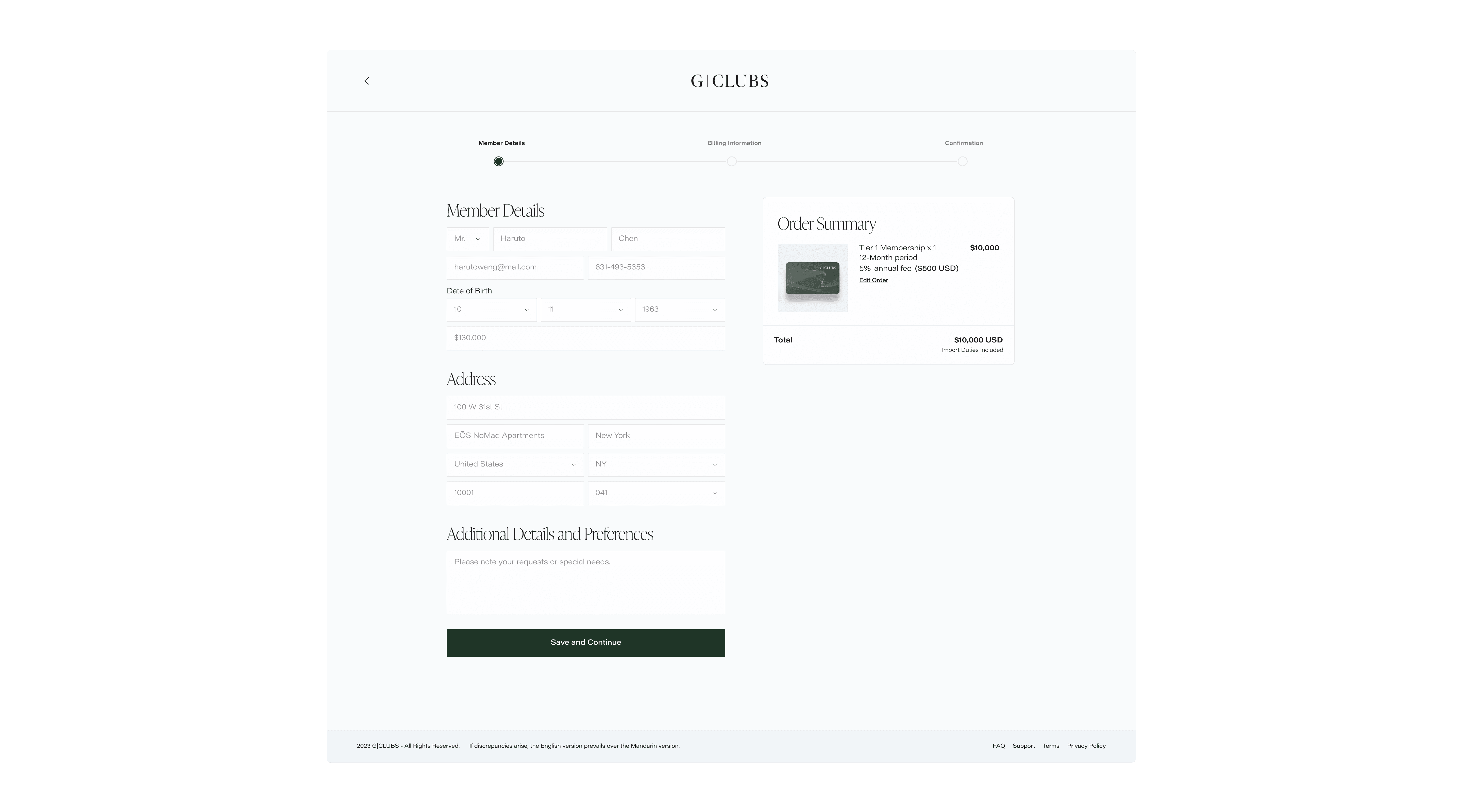
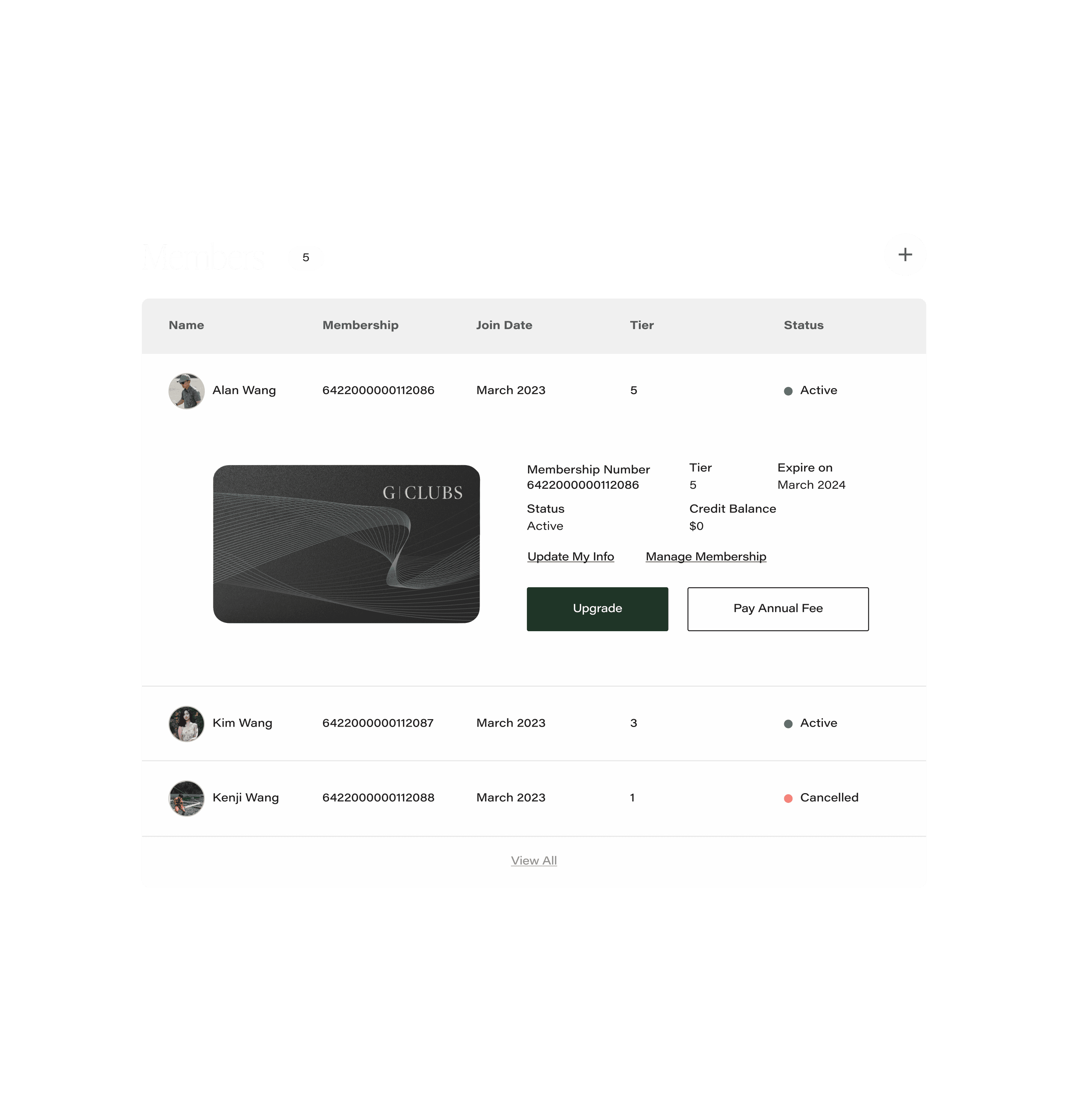
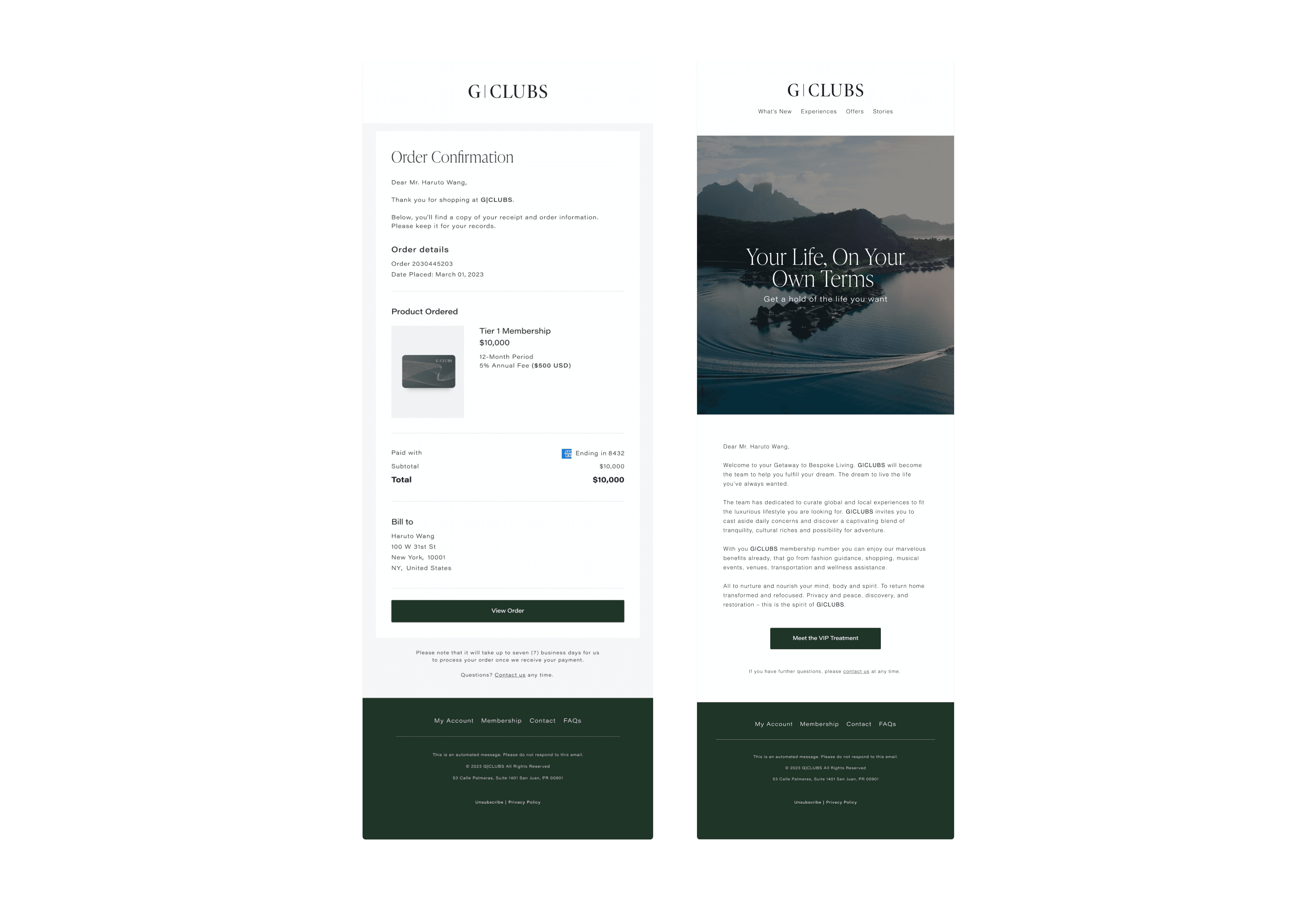
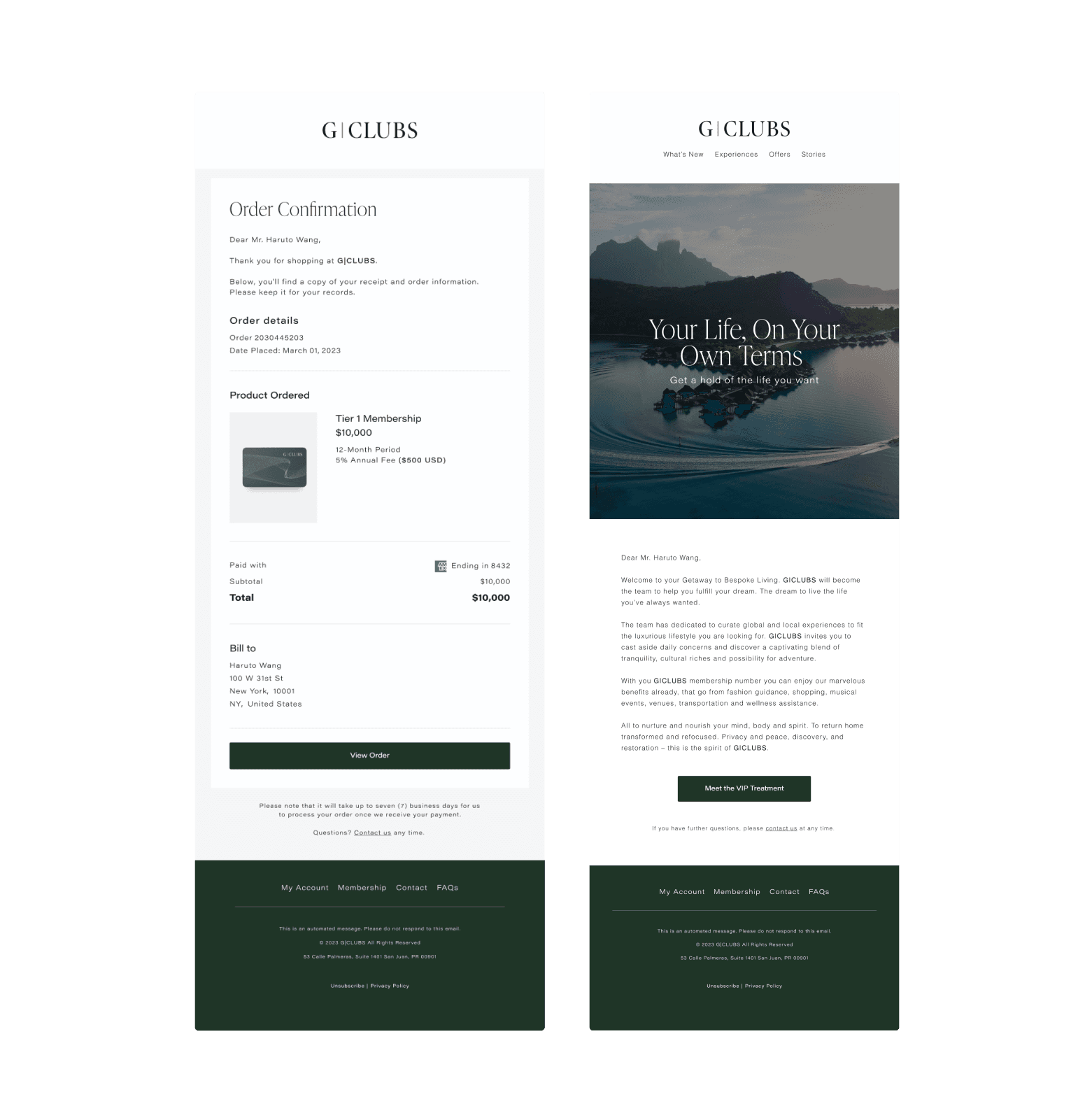
Through close collaboration with the engineering team, we implemented an expanded design system and a unified brand strategy. This included updating the public website and member portal, enhancing the e-commerce experience for applications and membership purchases, introducing a new membership management system, revamping the experience booking system, and improving both internal and external company communications.
Design Journey
01
Research & Analysis
The audit phase began with a collaborative discovery process, where I worked with the CEO to create a plan and roadmap aligned with business goals. Through research and analysis, I identified key issues, assumptions, and customer needs. Speaking directly with users helped me understand what they valued, what needed improvement, and what features were unnecessary, allowing me to focus on addressing real user needs. One critical issue was the lack of error prevention—users who exited a booking without completing it received no warnings, causing progress to be lost. Booking flexibility was also limited, as users lacked quick-access features to easily cancel or modify their bookings. Searches with no results failed to provide guidance or suggestions tailored to users’ purchases or preferences, leaving them without meaningful options. Additionally, the absence of a Mandarin language option restricted accessibility for Asian members, reducing the platform’s usability for this audience. The account setup process and clear membership tiers effectively communicated value to users. While users appreciated the concept of luxury personalization, they found the execution inconsistent due to a lack of booking guidance and visuals that didn’t align with the brand’s luxury identity.
Connect to Content
Add layers or components to swipe between.
02
Building a Scalable Design System
With a clear understanding of user needs, I extracted existing components and created design plots to analyze patterns. This process helped create and identify reusable and scalable components, prioritizing real use cases to ensure consistency across teams and address real user needs. The audit uncovered inconsistencies in both visual and functional elements, prompting the creation of a comprehensive style guide, typescale system, and scalable design system. The style guide defined primary, secondary, neutral, and semantic colors with multiple shades, providing flexibility and accessibility. Semantic colors, like success, warning, and error, clearly communicated status while aligning with user expectations. The design system incorporated reusable tokens for colors, typography, spacing, and components, ensuring scalability and consistency across all touchpoints. Each component was carefully tested and refined through iterative design plots to address real-world use cases effectively. For typography, the typescale system ensured readability and alignment with G|CLUBS’ luxury aesthetic. IvyPresto Display added elegance to English headings, paired with Acumin Pro Wide for body text and buttons. PingFang TC was chosen for Mandarin, maintaining cohesion across languages and enhancing accessibility. By iterating on components and collaborating closely with development teams, I ensured each element met functional and design standards. To support long-term scalability, I created a comprehensive ZeroHeight guide documenting use cases, component behaviors, and design principles. This guide bridged the gap between design and development, enabling a seamless and reusable system for future growth.
03
Ideation
The ideation phase prioritized simplifying the booking flow to enhance usability and efficiency. The redesigned process allowed users to log in, access the membership portal, select an experience, and confirm their booking with a saved payment method. This streamlined flow reduced unnecessary steps and significantly improved navigation. Initial wireframes explored various layouts for navigation and experience selection, while real-time feedback mechanisms were integrated to provide clarity at every stage. Stakeholders validated the proposed solutions to ensure they aligned with business objectives and user expectations. This iterative approach ensured a balance between aesthetic appeal and functional excellence.
04
Enhancing User Interaction
The usability testing phase focused on improving the booking process by analyzing how long it took users to complete tasks, the types and frequency of errors, and their overall feedback on the experience. Heat maps provided insights into user behavior, highlighting areas of low interaction and guiding design refinements. By streamlining the process, the number of clicks was reduced from 16 to 8, and booking times decreased from 120 seconds to just 90 seconds. These changes simplified the user journey, enhanced clarity, and ensured the platform was both efficient and aligned with user and business needs.
